Sustainability can mean everything or nothing if you’re not careful.
Background:
adidas has long recognized that sustainability is not only a moral imperative but also a strategic business advantage. Even before sustainability became a mainstream concern among Millennials and Gen Z, adidas had been developing over eight technologies and materials aimed at reducing environmental impact. These efforts were crucial for appealing to environmentally conscious consumers and ensuring long-term viability in manufacturing and supply chains.
Challenge:
Communicating the breadth and depth of adidas' sustainability initiatives across thousands of products proved challenging. Each product incorporated varying levels of sustainable materials and processes, making it difficult to convey a cohesive and honest message to consumers. The complexity risked diluting the brand's credibility in sustainability.
Solution:
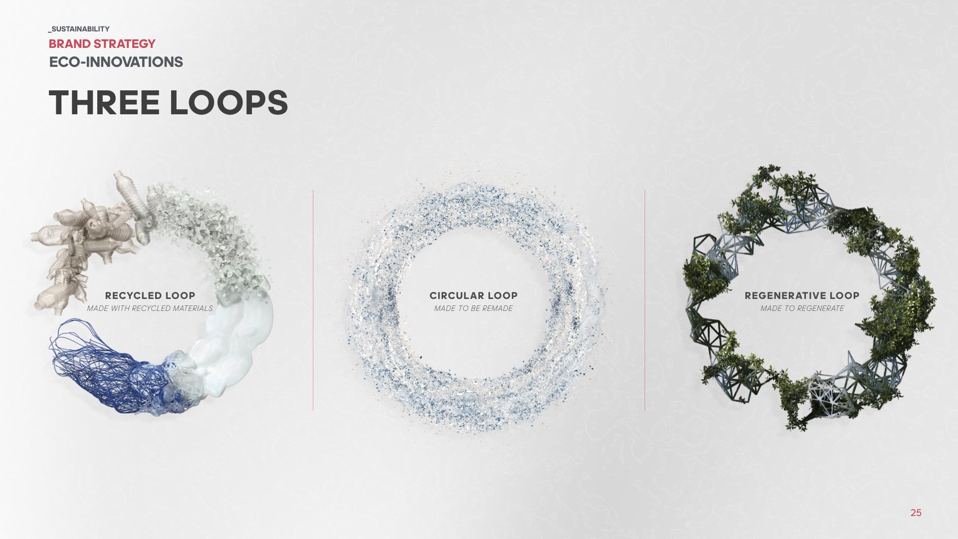
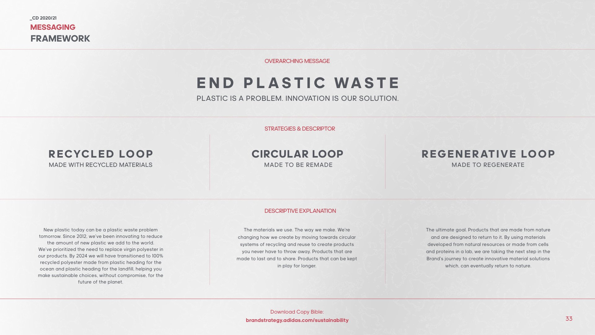
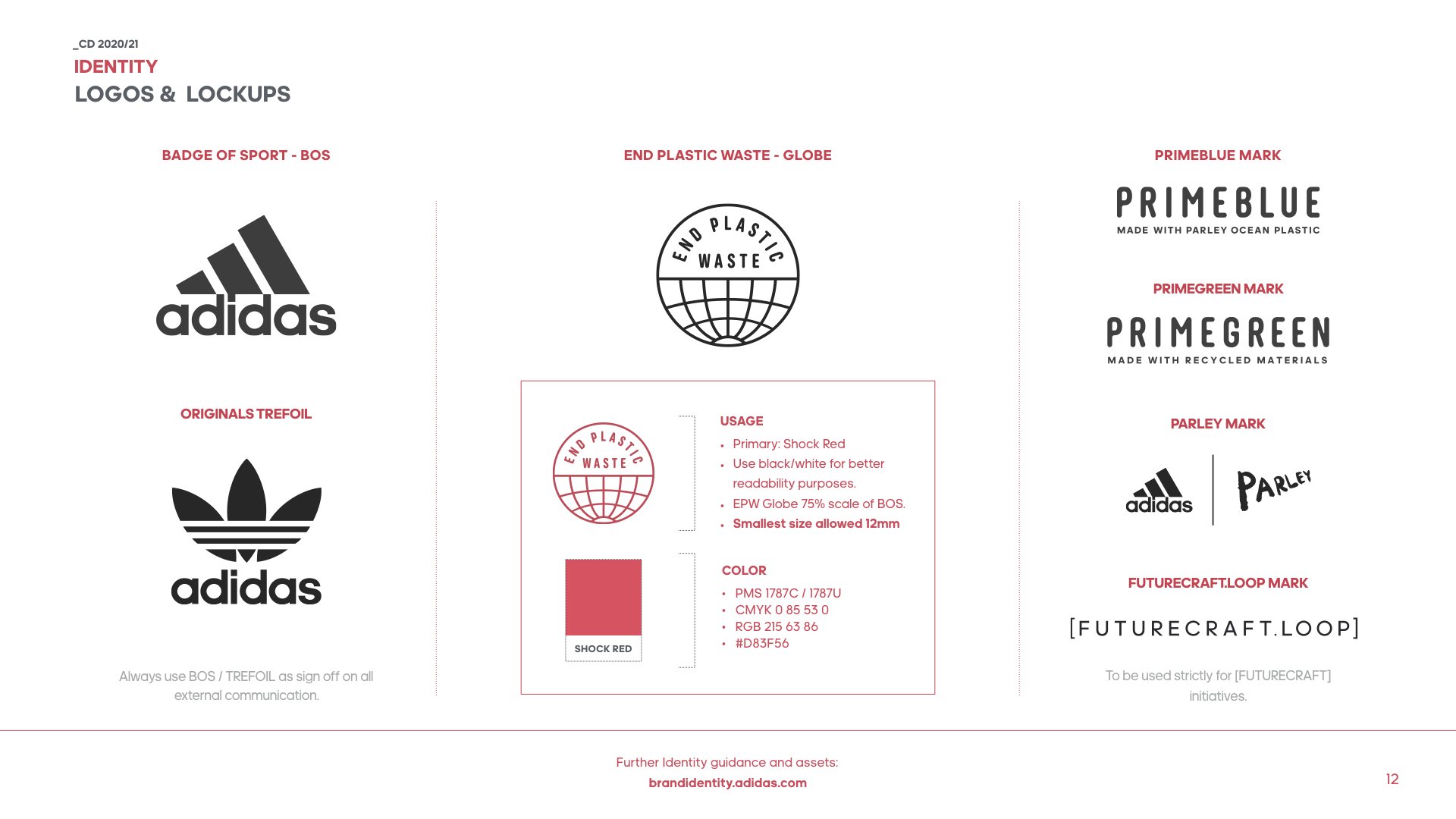
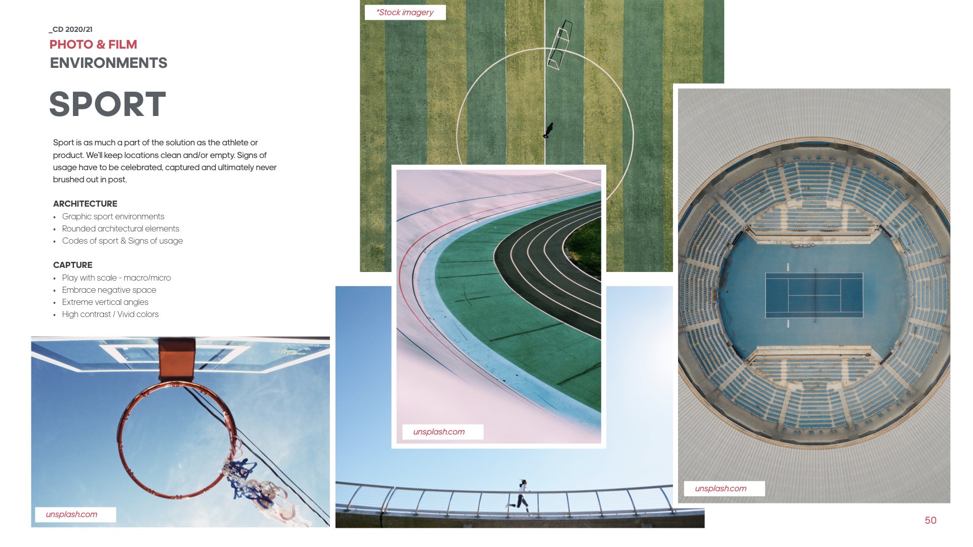
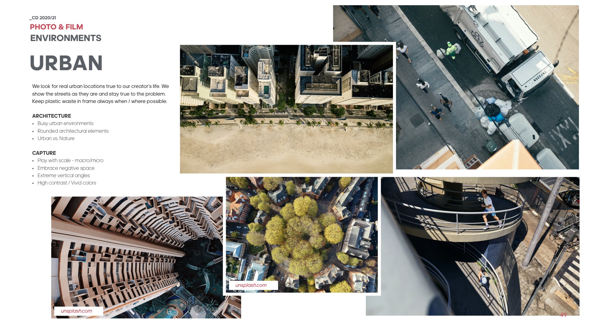
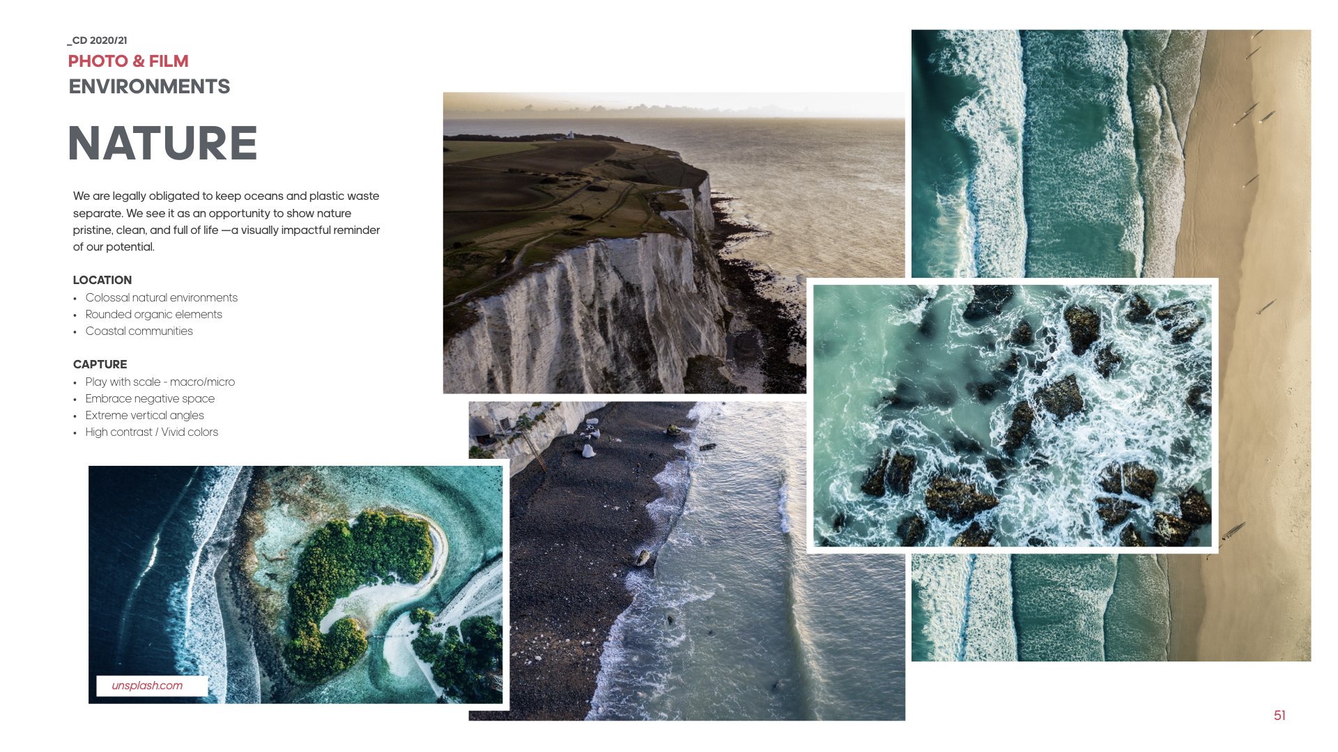
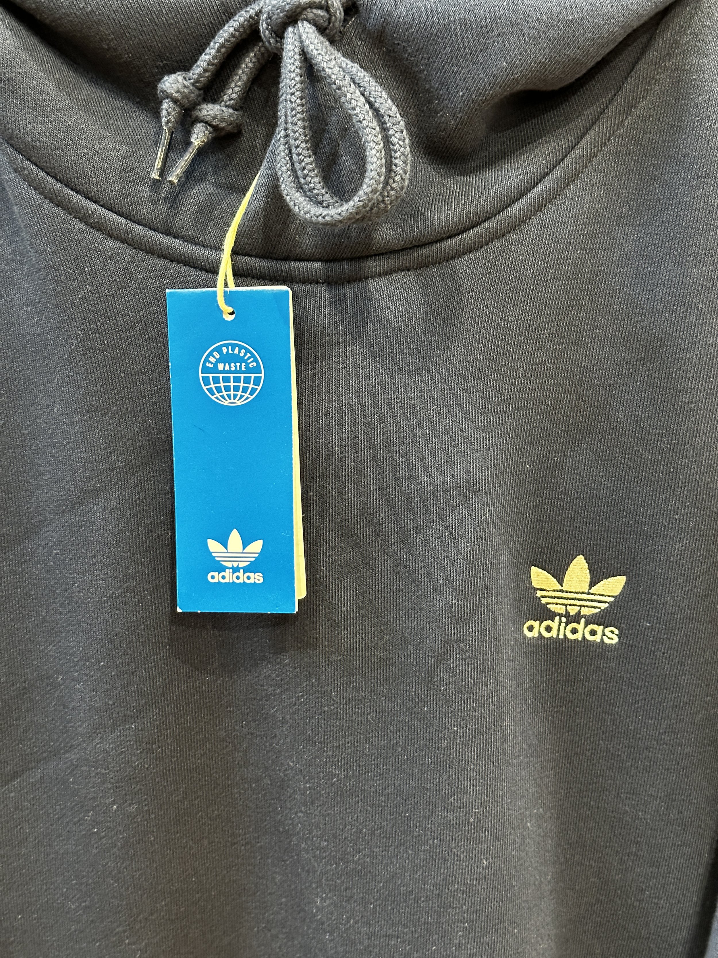
To address this, adidas consolidated its sustainability messaging by investing in a singular, unifying icon and creative direction that represented the company's commitment to sustainability. This icon was strategically deployed across key touchpoints, namely packaging, and product labeling to guide consumers toward more sustainable choices. The creative direction was applied cross category at own retail, wholesale, and .com environments. The overall approach aligned with adidas' broader "End Plastic Waste" initiative and their Three Loop Strategy.
Outcome:
The introduction of a unified sustainability branding system streamlined adidas' communication efforts, making it easier for consumers to identify and choose sustainable products. This simplification led to several tangible benefits: By eliminating special packaging, reducing extra product trims, and extending the lifespan of retail installations, adidas saved millions in marketing and product creation costs. Additionally, the standardized approach reduced complexity in product branding and communication, resulting in cleaner-looking products and a more cohesive brand message.
We wanted to keep the icon simple, intuitive, and direct so it can communicate by itself without additional support.
To address the aggressive three-loop strategy that spanned the entire range, we needed a strong and simple creative direction and identity that could both stand alone and complement other key brand initiatives initiatives.
Product Branding
The sustainability product branding guidelines needed to work with 2 brand marks, 7 key technology franchises as well as numerous athlete identities and brand collaborations.
Two separate documents were created for footwear and apparel, to address the unique challenges for each.


